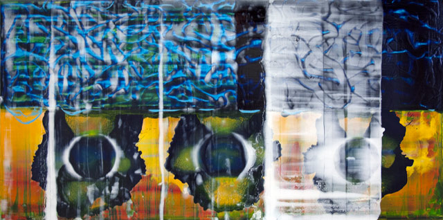
John Cronin, “Standard Deviation” (2012), oil on aluminium, 60 x 120 x 3 cm (all images courtesy the artist and Red on Green Gallery, Dublin)
1.
DUBLIN — John Cronin, an abstract painter in his late 40s, who has been exhibiting his work regularly in Ireland since the late 1980s, was — for this viewer — a wonderful revelation. Little known in America, it was clear from the moment that I walked into the high-ceilinged gallery space that Cronin was up to something. The most obvious is a preoccupation with the nature of paint’s materiality, and beyond that, with the status of painting at this late point in history. Instead of choosing the path of solutions and a signature style, he has elected the territory of investigation and discovery. Rejecting the commonplace answers of parody and citation, he focuses on the how and what of painting.
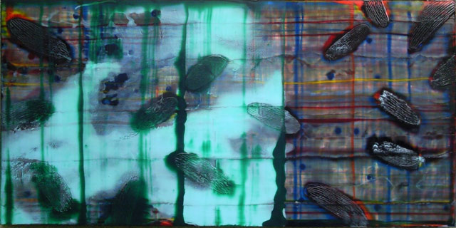
In his recent exhibition, Standard Deviation, at the Green on Red Gallery (May 30 – July 6, 2013), the aluminum sheets that make up the surfaces of his paintings are covered with thin layers of translucent colors; puddles, slashes and spills; scraped, sanded and scarred areas; built up grooves and ellipses, none of which add up to an overall image or dissipate into randomness and chaos. Cronin has long preferred to work on hard industrial surfaces, partly because he finds their resistance useful and partly because he has consciously rejected the canvas and the long history of effects that happen when it interacts with paint. With their glossy, metallic artificiality, his quinacridone colors look like they came out of a custom car shop.
John Cronin, “Standard Deviation” (2012), oil on aluminium, 60 x 120 x 3 cm
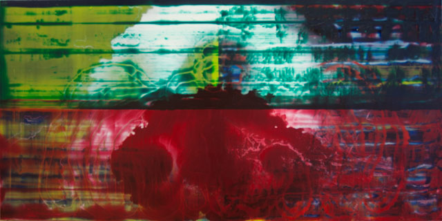
Cronin’s paintings are a record of their coming into being, which links them to Abstract Expressionism. The difference — an important one — is that they convey no nostalgia for the so-called glory days of painting. In addition to being done on aluminum, they do not rely on gestural brushstrokes; the one big splash of poured white paint I saw in one painting was a solid puddle spreading into tentacles of insubstantiality, while evoking the harsh, ghostly light of computer screens. The artist further reinforces the connection to computers elsewhere in this painting through the use of artificial colors we associate with the web.
2.
The one recurring motif that tied the majority of this diverse group of nine horizontal paintings together was the placement of three evenly spaced circles across the lower half of the composition. The long, narrow formats are panoramic in their breadth, suggesting the focus is on landscape. If so, it is a landscape recorded through technological means such as a spectrometer.
Recalling the exhibition’s title, the circles might represent the standard, with the rest of the elements in the painting being the deviation. Some of the circles, it might be noted, are solid while others have been scraped away, leaving only a trace, and still others seem to be dissolving, suggesting that no standard is fixed and everything can be called into question. This reflects back on the global situation, which is in a state of cataclysmic transition.
John Cronin, “Standard Deviation” (2012), oil on aluminium, 60 x 120 x 3 cm
Cronin’s paintings occupy a no-man’s land, hovering between form and dissipation, solidity and decay, with everything existing in an in-between state. The translucent layers define the plane as a screen rather than as a surface, which links the artist to David Reed, Philip Taaffe, Fred Tomaselli and, to a lesser degree, Pieter Schoolwerth. They evoke hot glass, connecting the paintings to silicon computer chips and to boiling liquid in laboratory beakers, as well as the hand-painted films of Stan Brakhage.
At one point, the synthesis of form and dispersal reminded me of the moment when a human is sent to another dimension in a sci-fi flick, transforming the body into a weirdly colored silhouette of energized matter. In contrast to many painters of his generation, this allusion to pop culture is secondary at most, which adds to the work’s manifold possibilities.
On one level Cronin’s work is about painting as a disintegrating, scarred thing, whose surface consists of layers of history that have been covered and effaced. And yet — contrary to what one might expect — there is nothing mournful about these paintings. The jarring juxtapositions of color, shifting viscosities, and the variety of ways he bonds the visceral with the apparitional can be read as an accumulation of gestures in which the artist tries to make something he has not seen before.
The obvious criticism would be that the painting is merely a collage of effects, but I don’t think this is true in Cronin’s work. Rather than unpacking a bag of tricks, which seems true of many stylish postmodern abstract painters, a sense of urgency comes across in these works. This is where they pack their sizeable wallop. At the heart of Cronin’s paintings is his obvious fascination with mutation as something that is wondrous, frightening and inescapable.

John Cronin, “Standard Deviation” (2012), oil on aluminium, 60 x 120 x 3 cm
Cronin’s paintings evoke the invisible world of human and electronic viruses and subatomic waves, as well as the digital realm and postmodern palimpsests. And while his work is linked to the artists I have cited, there is something cruder about what he achieves.
Citing Edward Dahlberg’s belief that “one perception must immediately and directly lead to a further perception,” the poet Charles Olson asserts that a writer must “ engage speech where it is least careless — and least logical.” Substitute “paint” and “painting” for “speech” and you will get some idea of what Cronin has been up to. In his desire to expand the space of seeing and thinking, Cronin’s restlessness and experimentation should place him well outside Ireland’s artistic seaboard.
John Cronin: Standard Deviation was on view at Green on Red Gallery (26-28 Lombard Street East, Dublin) from May 30 through July 6.
Comments
Post a Comment